

When starting up your business it’s essential to think about your branding colours. It will be the colours of your branding that will be acknowledged first. Surprisingly it isn’t the logo that makes your brand stand out, it’s your choice of colours.
That’s why we’ve got the perfect 4 tips to help you create your palette with ease.
1. Keep It Simple
Just take a look at well-known brands such Starbucks, Facebook, Coca-Cola and Samsung. These organisations keep it simple, their colour palette is very minimal and yet their branding is very recognisable.
Although you may want every colour in the rainbow, keeping your branding with minimum colours is best. Using a few colours will strengthen your brand, too many will dilute it.
Our tip is to pick one main colour and then you could use about two complementary colours. Using different tones and shades
2. Include A ‘Call To Action’ Colour
When choosing your colours always choose an additional colour for anything that requires an action from your customers. Whether it allows the customers to recognise when to click on a button on your website to download or buy or click a link in the email.
To choose the colour, you should select a colour stand out, the colour opposite your main brand colour on the colour wheel.
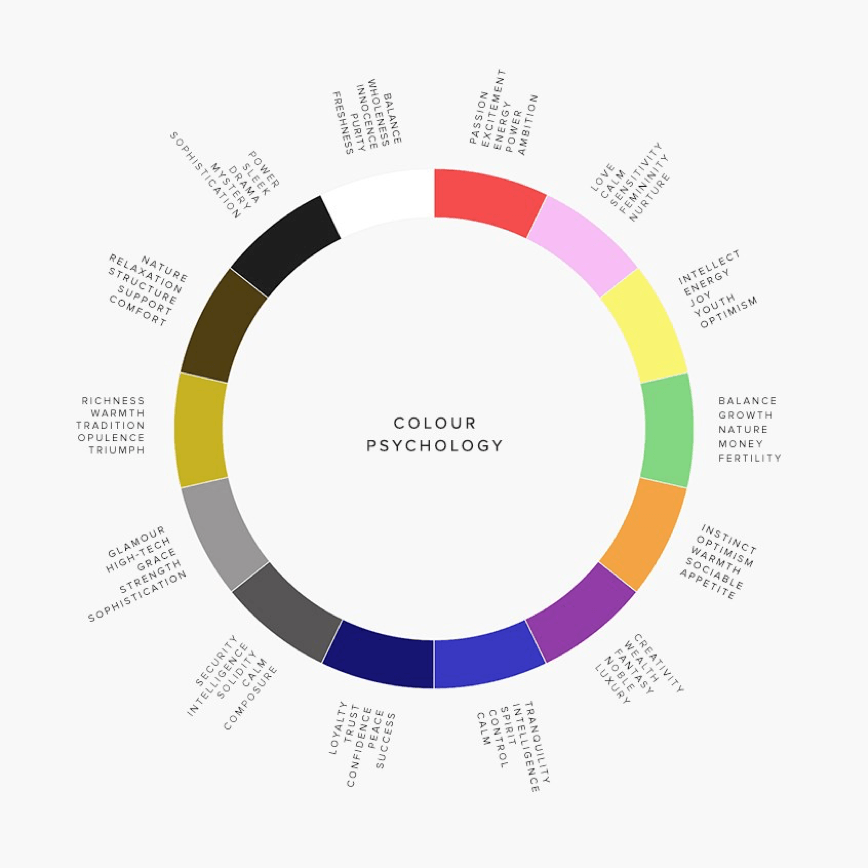
3. The Associations of Your Colours
Each colour has a separate meaning so it’s important to pick a colour that reflects your branding and organisation. Look into the psychology of the colour before picking so it suits your company vision and gives the right message to your customers.
It’s not just the colour but also the shade and tone that has different meanings. For example, one shade of yellow can mean ‘warning’ but another shade can be associated with joy and happiness.
Below just gives you a little insight into the different associations to different colours

Image: www.luxdeco.com
4. Check Your Competitors
Once you have got the perfect mix of colours to represent your brand, double check and do a little more research. Check that the colours and your logo aren’t too similar to a competitor. This will just confuse your customers and could definitely get you in trouble regarding copyright!
However, don’t be scared to be slightly similar, for example, Facebook and Twitter are both blues! The key is to still stand out and be distinct, with different shades and diverse logos. It’s all about the combination of your main colour, accent colours, and your logo design. If it’s different enough from your competitors that it is clearly a separate company, you’ll be fine.
Choosing your branding colours may seem easy however it takes time and lots of research. But once you’ve got it right, make sure it is something you are proud of and represents your business!
And don’t forget to get in touch with us if you want a helping hand!


